The Course Information System (CIS) is kicking off the New Year with a new look and feel – ready to save U of T faculty and administrators hundreds of hours of work.
After three months of usability testing and a survey conducted in early December 2018, CIS will display a redesigned homepage and other functional screens starting March 2019.
CIS was first developed with essential functionality for select units. Now it has been redesigned for a further expansion of its features and a broader user base, including new academic units across U of T. It streamlines syllabi and exams processes for instructors and administrators.
“CIS was initially designed to address some essential business needs. It served that purpose fairly well, but it’s also a living, breathing product that we envisioned as growing to support additional processes,” says Mike Clark, manager of user experience and process design with Enterprise Applications & Solutions Integration (EASI). “We’re now at a point where it makes sense to update the major aspects of the system’s design to accommodate those changes, and continue to afford a successful user experience.”
The system, created by EASI in partnership with the Office of the Vice-Provost, Innovations in Undergraduate Education, is currently being piloted in three divisions on two campuses. It is divided into three modules for instructors to submit syllabi-related materials, pre-exam and final exam details.
“CIS is beginning to reach its full potential in how faculty and staff not only administer courses, but also how it will streamline business processes,” says Julian Weinrib, director of the Office of the Vice-Provost, Innovations in Undergraduate Education. “We’ve built a strong foundation for the system and the design updates are a big step that will signal its growth.”
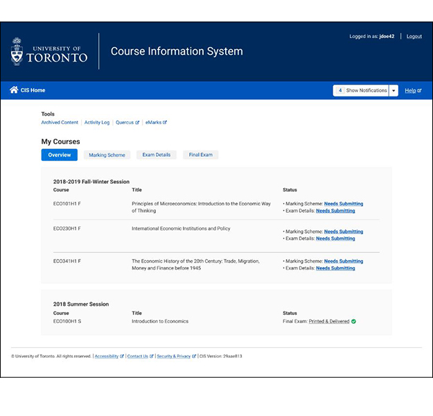
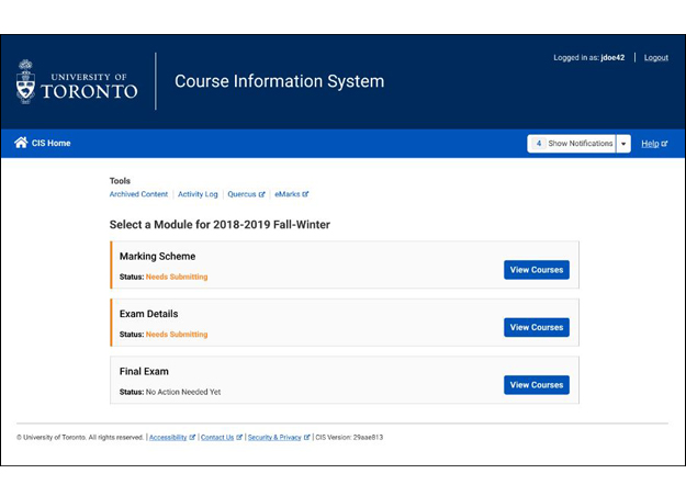
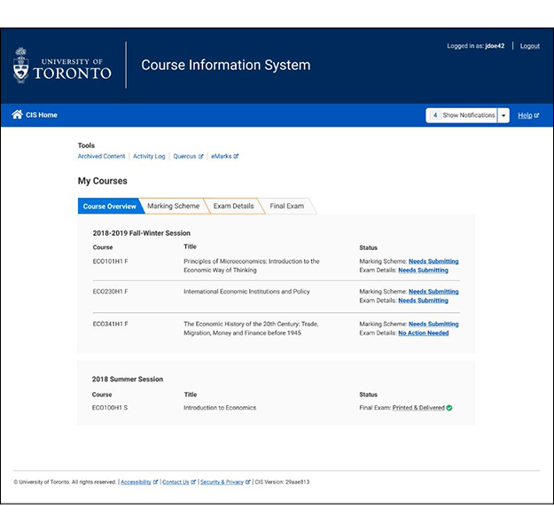
To create the redesign, the EASI user experience and process design team conducted extensive one-on-one interviews and usability tests followed by a survey sent to all CIS users. The survey asked users to vote on the three different options by ranking them overall, critiquing specific aspects of each concept, and inviting optional long-form qualitative feedback on what respondents thought of each concept.
One option featured the task areas in CIS.
 Another option featured a tab-based navigation with courses at the forefront.
“We employed our user-centred methodology to figure out which of these options would be most intuitive and usable to the end users,” says Sydney Jia, a user experience researcher with EASI. “We had 85 respondents and were happy with the results, especially because many users provided detailed responses.”
At the end of the extensive research process, users preferred the option with tabs in the navigation and a workflow based on their courses.
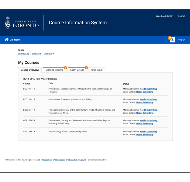
The final, preferred option, featured a different tab design with courses at the forefront.
“It’s important to have this input,” says Jia. “This is a way for users to be genuinely part of the process early on and we can shape the system for their needs. We’re helping to facilitate the best solution for them.”
After receiving and analyzing all of the feedback, the team then integrated it into an improved final design.
The simple design indicates the statuses of an instructor’s course content and what actions are required.
What’s next for CIS?
In the future, two more undergraduate divisions will be onboarded to the system in summer 2019. The team will also focus on developing an administrative interface to allow divisions to manage their own data within the system.
“As the system evolves, we will be conducting future research activities to ensure users are getting the best experience possible,” says Clark. “We invite anyone who would like to participate in the process to reach out to us – the feedback is invaluable.”
If you are a faculty or staff member who has feedback regarding CIS, please contact cis.help@utoronto.ca


